
Design System

120+
Components
60+
Styles
40+
Templates
Problem
Designing at scale often leads to inconsistencies,inefficiencies, and a lack of unified visuallanguage. These challenges hinder collaborationamong designers and developers, resulting infragmented user experiences.
I created a design system with typography, colors, grids, spacing, components, and colortokens.lt ensures consistency, streamlinesworkflows, and supports seamless collaboration.
Solution
Develop a comprehensive yet accessible design system that bridges the gap between creativity and functionality. The system must support consistent branding, maintain scalability, and simplify handoff to development.
Goal
my role
At the beginning of this project, I worked with the Front-end Developer to complete the functionality of the page using the Element component library. After verifying that the direction of the product is feasible, I led my team to redesigned the whole components.
components
120+
80%
60%
Time for design
Time for coding
outcome
Project overview
Design systems: paving the way for seamless and unified experiences
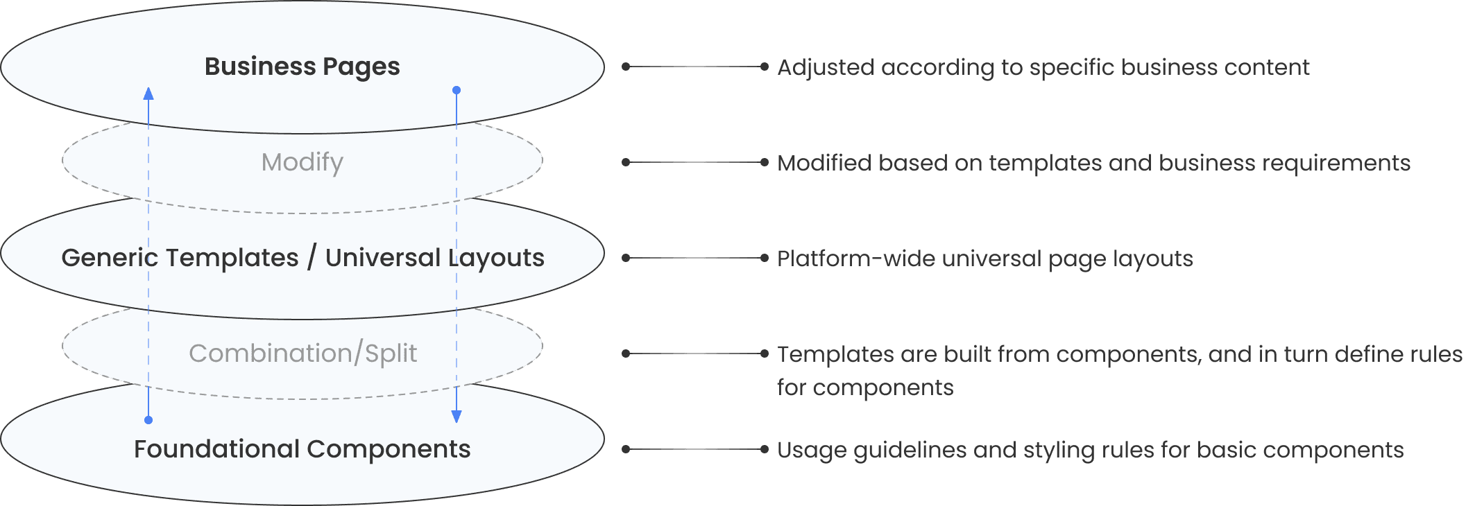
Atoms
Molecules
Organisms
Templates
Pages
“Why do I have to design the same button repeatedly?”
Designer

“Why do I need to build similar pages again and again?”
Developer

“Why does this page look inconsistent with the rest?”
User

Design goal


Consistency
Creating a library of reusable components streamlines design and development by eliminating repetitive work.
Align with user habits, clarify hierarchy, and strengthen affordance through clear interaction cues.
A unified design language with consistent interactions and visuals builds habitual user pathways.
Efficiency
Experience
Primary colors
Blue is the primary color, used mainly in primary actions, text links & buttons.
As it indicates the trust, peace & loyalty.
Colors
Grayscale Colors
Functional Colors
Brand Accent Colors
According to the Web Content Accessibility Guidelines (WCAG 2.0), it is recommended to follow these contrast ratio standards for text and images:
Minimum contrast (AA level): At least 4.5:1 for regular text and visuals, and 3:1 for large text or prominent graphics
Enhanced contrast (AAA level): At least 7:1 for regular text and visuals, and 4.5:1 for large text or prominent graphics
These colors convey functional information and represent specific statuses. They are mainly used in notifications, feedback messages, and form validation scenarios, such as success, warning, and error states.
These colors assist designers in matching different business brand palettes (including primary and secondary brand colors) across products.


4A80F5
#4A80F5
#010202
#FFFFFF
Blue
Neutral
White
Typography
family
POPPINS
ABCDEFGHIJKLMNOPORSTUVWXYZ
abcdefghijklmnopqrstuvwxyz
0123456789
Desktop
underline
line-through
ON Mobile
h1
h1
h1
h1
64px / 80px / 700
40px / 50px
h2
h2
h2
h2
48px / 64px / 700
32px / 42px
h3
h3
h3
h3
32px / 48px / 700
24px / 36px
h4
h4
h4
h4
24px / 36px / 700
20px / 30px
h5
h5
h5
h5
20px / 30px / 700
18px / 27px
h6
h6
h6
h6
18px / 28px / 700
17px / 26px
subtitle1
subtitle1
subtitle1
16px / 24px /600
subtitle2
subtitle2
subtitle2
14px / 22px /600
body1
body1
body1
16px / 24px /400
body2
body2
body2
14px / 22px /400
Button Large
15px / 26px / 700
Button Medium
14px / 24px / 700
Button Small
13px / 22px / 700
Caption
Caption
Caption
12px / 18px / 400
Overline
Overline
Overline
12px / 18px / 700 / spacing: 1.1
Icons
Icon Design
Application Principles
Icons should clearly convey operational meaning and quickly trigger user recognition, helping users understand and process actions more efficiently.
High recognition: Easy to read, easy to identify, high contrast
Clear structure: Organized, clear, with good guidance, alignment, abstraction, and consistency
Visual appeal: Unified styling based on geometric construction, with a sense of rhythm, emotional resonance, and innovative form
1024/16=64
1024
1024
Buttons
Buttons are usually styled links to attract users and drive them in a specific direction. Through buttons, we can link to other pages orfinish tasks like a form submission or buying online.
Contained Buttons
Color
Default
Primary
Info
Success
Warning
Error
States
Enabled
Hover
Disabled
Size
Large
Medium
Small
Large
Medium
Small
Outlined Buttons
Color
Default
Primary
Info
Success
Warning
Error
States
Enabled
Hover
Disabled
Size
Large
Medium
Small
Large
Medium
Small
Text Buttons
Color
Default
Primary
Info
Success
Warning
Error
States
Enabled
Hover
Disabled
Size
Large
Medium
Small
Large
Medium
Small
Icon Buttons
Color
States
Size
FAB Buttons
Color
States
Size
Button group
Contained
Left
Center
Right
Left
Center
Right
Outlined
Left
Center
Right
Left
Center
Right
Text
Left
Center
Right
Left
Center
Right
Vertical
Top
Middle
Bottom
Top
Middle
Bottom
Top
Middle
Bottom
Size
Left
Center
Right
Left
Center
Right
Left
Center
Right
Top
Middle
Bottom
Top
Middle
Bottom
Bottom
Middle
Top
Toggle Buttons
Standalone
Group
Group
TextField

Select

Textarea
States
Hint
Rule YouTube
When you browse through videos at
YouTube, which do you usually click first
Label
Form Elements
Notification
Alerts
Snackbars
Default
This is a default message!
This is a info message!
This is a warning message!
This is a success message!
This is a error message!
Action
This is a default message!
No
Yes
This is a info message!
No
Yes
This is a warning message!
No
Yes
This is a success message!
No
Yes
This is a error message!
No
Yes
This is an Info alert — check it out!
This is an Success alert — check it out!
This is an Warning alert — check it out!
This is an Error alert — check it out!


Learnings and Takeaways
Consistency is key, but so is flexibility.
Building a design system is an ongoing process that evolves with the product.
Effective communication between the design and development teams is crucial for success.

A design system is more than just a set of UI components—it's a mindset. It's about establishing a foundation for creating scalable, efficient, and user-friendly digital products.